

.svg)
Key takeaways
- Webflow combines visual design with clean, production-ready code, removing the need for heavy manual development.
- You can build almost any type of website, from marketing and SaaS to ecommerce and dynamic content sites.
- Webflow Designer and Editor let teams design, edit, and publish visually, without relying on developers for small updates.
- Webflow CMS makes it easy to manage content, create dynamic templates, and scale pages efficiently.
- Compared to WordPress, Wix, and Squarespace, Webflow offers better customization, cleaner code, and stronger SEO performance.
- Flow Ninja helps businesses unlock Webflow’s full potential with expert design, development, and ongoing optimization.
Webflow is a visual website-building platform that allows you to develop state-of-the-art websites with complete design, content strategy and code control.
After reading this ultimate guide to Webflow you will know:
- What can you build with Webflow?
- Is Webflow a coding tool?
- Is Webflow a design tool?
- What are Webflow Designer and Editor (tools)?
- What is Webflow CMS?
- When do you need to hire a Webflow Design and Development agency or Webflow SEO expert? When can you do it alone?
- How much does it cost to have a Webflow website?
- How does Webflow compare to Shopify? WordPress? Wix? Squarespace?
{{cta}}
What Types of Websites Can You Build with Webflow?
Many things changed over the years as Webflow (and surrounding third-party tools) became more and more powerful.

So currently, you can build 99% of responsive websites with Webflow. With Webflow website builder you can build:
- One page websites (portfolios and offers)
- Marketing websites
- SaaS websites
- Business websites (local or international)
- Ecommerce websites (digital or physical)
- Blogs and niche Websites
- Programmatic SEO Websites
- Webapps
- Online tool websites (calculators, converters, etc.)
- Gated content sites (courses and subscriptions)
- User generated content websites
- …etc.
Yes, from building apps in Webflow to complex pSEO builds — you can build almost any type of custom website in Webflow!
Webflow for Visual Development
Learning to use Webflow can be easy or difficult, based on the professional background you come from.
That’s because Webflow is not a no-code tool. It’s actually a powerful visual code editor. So if you understand the basics of HTML, CSS, and JS, you should pick up Webflow website building easily.
If not, there will be a learning curve, but nobody should be afraid of learning how to use Webflow. That’s because:
- With Webflow, you learn the basics of how CSS and HTML works, without knowing that you are learning about it
- Webflow University is one of the best free web design and development universities online
HTML
All of the Web is based on HTML, and Webflow websites are no different. Webflow has an HTML drag-and-drop component section that allows you to add headings, paragraphs, divs, links, and many other basic HTML components.
Furthermore, you can ID tag them, assign attributes, and of course… Style them with CSS.
CSS
CSS class usage with styles and global tags is made so much easier. Imagine Photoshop for Website CSS editing. That’s what Webflow is!
You can resize, change colors and even apply CSS animations to different component states. Complete design control at your fingertips!
JavaScript
If you can’t make Webflow do something natively, Webflow supports all types of custom code - be it HTML, CSS, or JS.
Furthermore, Webflow allows you to visually create JavaScript if you want to make complex interactions (web page animations).
This brings us to…
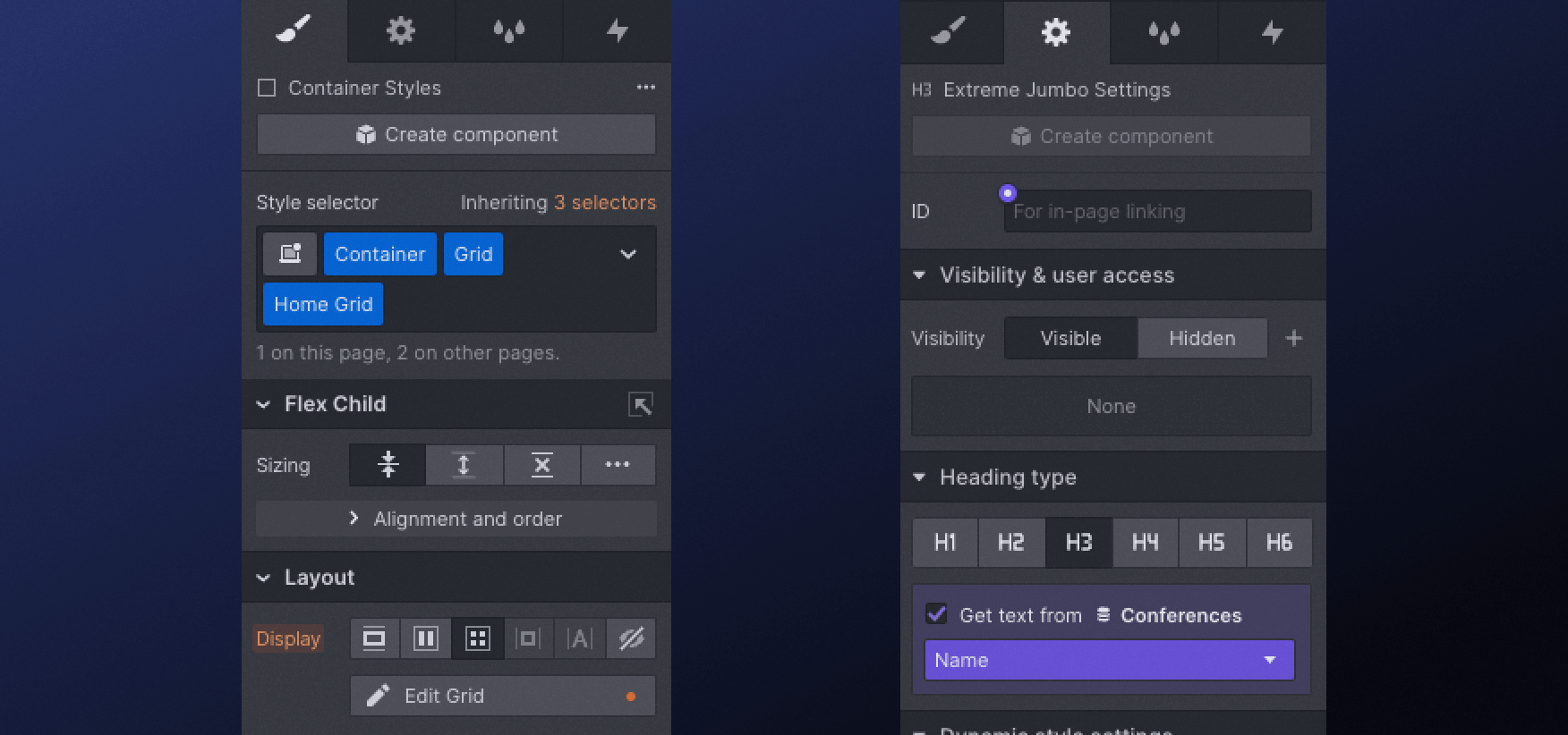
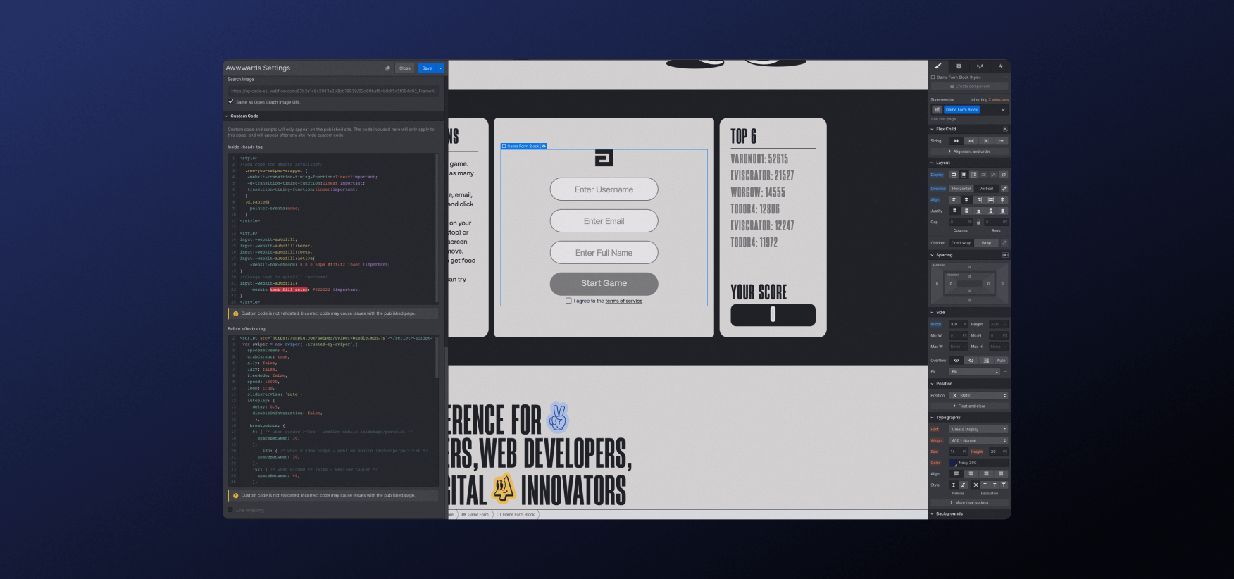
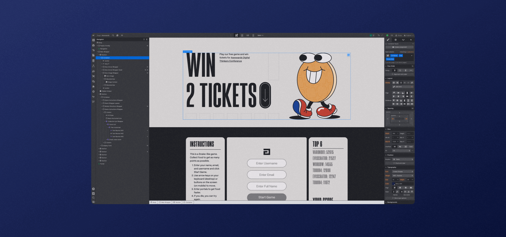
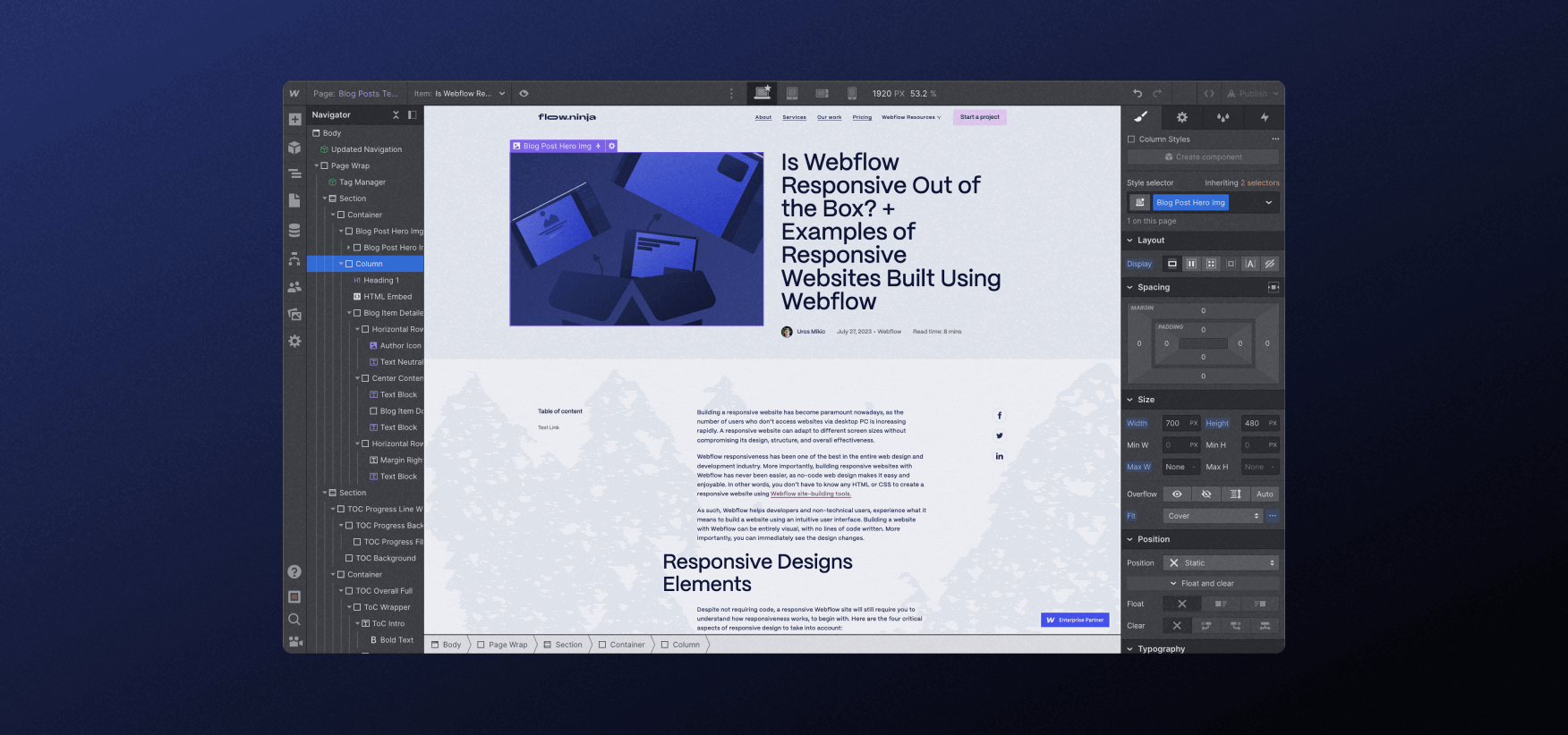
Webflow Designer
Webflow Designer is the main tool where you create your Website. This is where you create new pages, style sections and publish your website after you are done with code manipulations.
While the tool is called designer, it’s actually more like…
Code-Based Design Tool
Being the most powerful visual code editor out there, Webflow differs from any other design tool in that… Well, it’s a code editor that has a UI that reminds me of Photoshop or After Effects.
It still runs on basic code principles and those who don’t have much experience with the fundamentals of web development might face a challenge.
Designing in Code?
Before we jump into the next section — I must say that Webflow also paved the way for a new type of web designer, DEVsigner.
It’s a designer that designs in code and doesn't need to work with a front-end developer to execute their designs and release their websites.
This also means that designers who skip Figma and design in Webflow can save time. Above all, they can view and interact with the site at any stage of their design/development process.
If you still want to work in Figma first, no worries!
Figma to Webflow Plugin
Figma to Webflow plugin allows you to turn your Figma designs into real websites on Webflow. As with any automated solution, there are limitations and rules to follow, but if you are interested to learn more… Check out our Figma to Webflow video where you will learn everything there is to know about it!
Oh, and there are plenty of Webflow development agencies and freelancers that specialize in taking Figma designs and rebuilding them in Webflow. We will talk more about that later in this article!
Webflow Editor
If you are a business owner, or marketer, or have non-technical team members — this is where Webflow truly shines!
If you have access to your Webflow website, adding ?edit after any URL will allow you to select any text, image, or link and… Edit it directly.
Front-End Website Editing
While Webflow Designer is the best tool for visual website development, Webflow Editor is probably the most user-friendly visual website editor for non-technical people.
Of course, within Webflow Editor you also can see all pages on your website, create new CMS pages (we will explain what that is in the next section), update metadata for SEO and more!
All that with no need to understand how coding or design works. Just click and edit, press publish and go live. No need for developers or designers to make simple changes to your Webflow website!
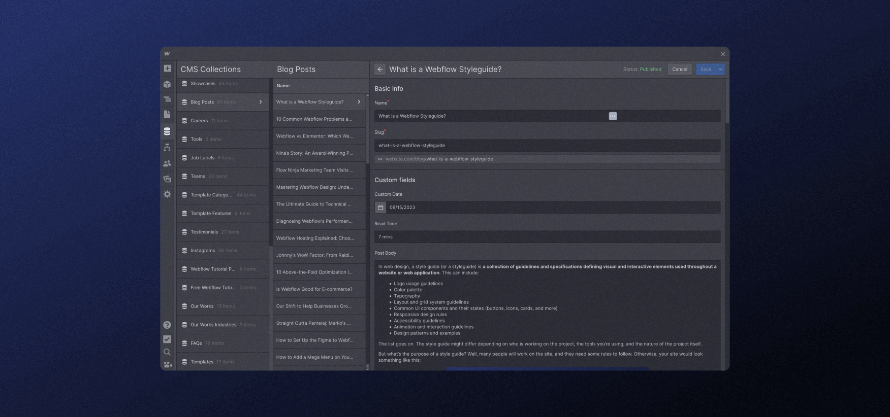
Webflow CMS (Content Management System)
Both Webflow Designer and Editor allow you access to one of the most important and powerful Webflow features with so many customization options… Webflow CMS!
CMS stands for Content Management System and it basically means… CMS is an easy non-technical way to manage, change, update, and modify the content on your Website.
The only difference is that in Designer you can actually create or build any CMS (data infrastructure) and within Editor you can only use what has been already created.
CMS Collections
In Webflow, CMS Collections are basically your dynamic content types that share the same design but can have different content and each item has a unique URL.
When you hear about CMS Collection, think of
- articles
- blog categories
- services you provide
- products
- shop categories
- team members that work here
- job ads for open positions
...and so much more. Each one of these would be a CMS Collection on your Webflow website.
Each CMS Collection has two main components which make Webflow websites so powerful:
- Data fields (think of a form that allows you to create a new page each time you fill it in)
- Page visual design (that will inherit data from those form fields when you publish it)
What makes Webflow unique from other website builders is that each CMS Collection can be connected to (referenced) other CMS Collections. This might sound simple, but because you can create your own fields, it makes Webflow the most powerful CMS tool out there!
CMS Collection Templates
Now that we know what CMS Collection is, we have to understand how Webflow CMS Collection templates work. Webflow CMS Collection template is basically a dynamic web page design.
Here’s the simplest way to understand what a CMS Collection template is…
You design a blog post page — where the heading will go, how big the image will be, and what font the blog post will use. That’s your CMS Collection template.
Now each time you add a blog post to the blog post CMS Collection, it will create a new page that will behave and act as it was designed in the template. Though each blog post will have unique URLs and content, they will share the same design.
That’s CMS Collection templates and the dynamic power you get.
Webflow Logic and Other Features
Webflow also allows you to create operational logic, translate your website to other languages, create React apps, and have so many other features that I won’t get into here.
And that’s native! Don’t get me started on possibilities when it comes to using third-party tools in combination with Webflow. For now… Just know there’s so much more to Webflow!
Webflow Websites for Marketing
In the beginning, I mentioned that because Webflow is a front-end solution that offers complete code and design control — you can create almost any type of website. And that’s true!
What Webflow is mostly used to this day is marketing websites. Not because Webflow is bad at other types of websites, but because early adopters of Webflow were:
- Designers that wanted not to rely on front-end developers
- Developers that looked for a faster way to develop complex components
And this meant that years ago, the strongest Webflow features fit perfectly into what marketing sites needed: custom design, UI flexibility, fast turnaround times, ease of editing, and non-technical CMS for marketing teams.
This brings us to something that I haven’t touched in this article yet…
Webflow SEO
Search engine optimization in Webflow has been taken to the next level. Webflow code is lean, content control makes it easy to match search intents and properly structured Webflow websites rank on search engines fast.
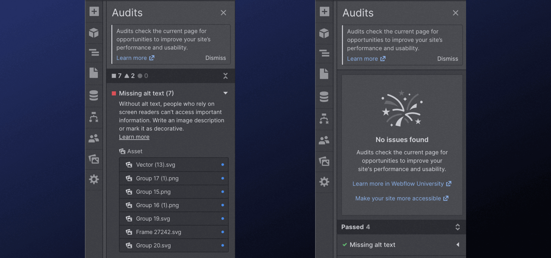
Most needed simple features like title tags, meta descriptions, automatic sitemap.xml, 301 redirects, and robots.txt come natively without any plugins, and complete code control means…
You can control your own structured data (schema markup), create functional internal linking systems and create different content types with unique designs for each search intent. And do that at scale with CMS.
Also, connecting your Google Analytics, Tags or Search Console can be done in a matter of seconds!
Content Marketing
This means that in a world where content is king, best-performing Webflow websites say goodbye to old practices like “blog = seo” and can create unique content types that rank for the keywords that their direct audience is searching for.
Page Speed and Performance
Hosting your website on Webflow means connecting your domain via the DNS manager of your choice to utilize their state-of-the-art AWS-powered deployment solutions for HTTP/2 (SSL), global CDN, advanced DDoS protections, and scalable servers that are online all the time.
When it comes to Core Web Vitals, compared to other platforms, properly developed Webflow websites push out very lean code that is easy to index and performs well. This means LCP, FCP, INP (previously FID), and CLS are not only never an issue, but also easy to fix in a matter of seconds because you control all that.

If none of these last two paragraphs made sense to you, I apologize for that — I promise they make sense for some people considering Webflow and reading this.
I will sum up for less technical readers: Webflow website performance and page speed is amazing. They use very modern state-of-the-art technical solutions, so you know you are in very good hands.
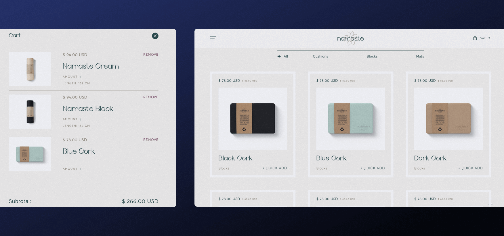
Webflow Ecommerce
Using Webflow for ecommerce stores comes with a few limitations, but in return, you will get complete design and UX/UX control… As none of the other ecom website builders or plugins offer anything even close to Webflow design and development capabilities.
Webflow integrates with Stripe and PayPal, so you can sell products in most countries of the world and accept most credit cards. There are unique cases for unique markets, where Webflow will not be the best solution because of these payment providers, so double-check before you launch your store on Webflow.
Selling Digital Products
This means that Webflow is definitely the best platform if you want to sell digital products online. Be it courses, ebooks, templates or anything else can be sold easily.
Emails for clients who bought stuff with download links will be easily automated, and you will not need to rely on a template to create any user experience you want.
Selling Physical Products
When it comes to physical products (products that need shipping), Webflow still offers an array of solutions and tools that might work for most new online stores. Amazing SEO, design control, and other Webflow features, combined with email marketing and payment gateways make Webflow viable… But not the best?
Yes, when it comes to e-commerce Webflow still lacks some features, which would make it extremely difficult to compete with ecom-first platforms like Shopify. There are ways around it, for example, you can connect Webflow and Shopify.
But in general, it’s no big secret, Webflow is amazing for digital marketplaces and not always the best choice for certain physical stores.
Webflow Pricing
Knowing exactly which Webflow pricing option to choose can be challenging at first. Webflow isn’t actually known for easy-to-understand pricing… Especially for beginners!
But after a while, you will understand Webflow plans easily. But here’s a quick and simple rundown of Webflow plans and costs associated with your new Webflow website.
Before we jump into plans, you need to understand the difference between website pricing and workplace pricing.
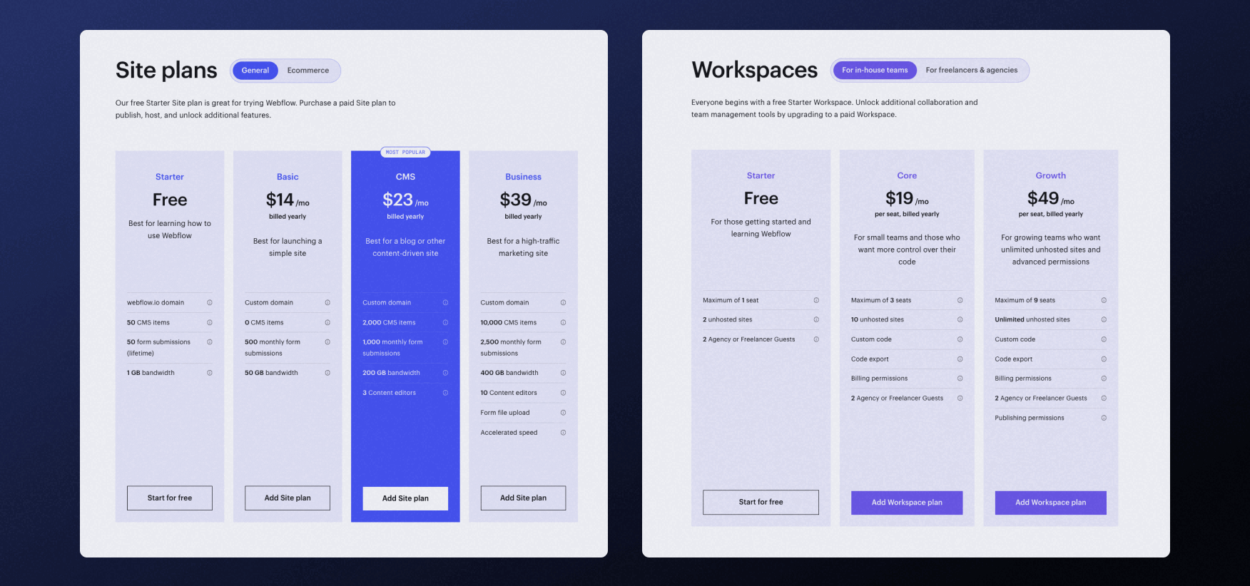
Website pricing means how much it costs to use Webflow, publish your website on a custom domain (yes, hosting is included in the price!), and use all features for one website.
Workplace pricing comes into play only if you want to have multiple websites and is generally aimed at freelancers, agencies, and in some cases… Businesses that run a lot of different websites.
Keep in mind that the site plans and workspace pricing below might be a bit different depending on the region, time, and currency. Also, prices below are listed if you pay monthly — yearly plans are obviously cheaper than that.
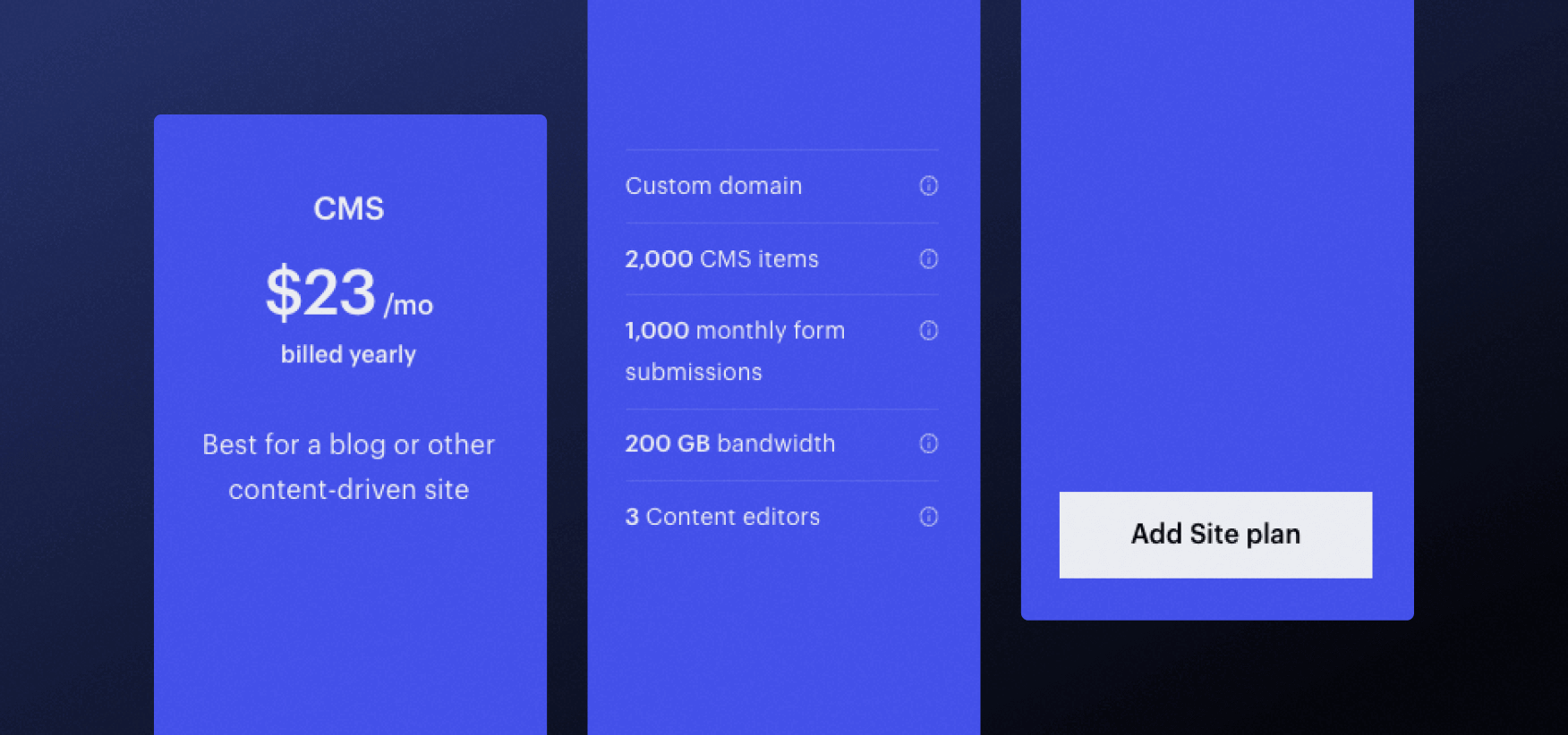
CMS Plans
If you don’t need a custom domain, Webflow is free to start. It’s $18/month to run a simple site and $29/month if you need CMS Collections (like a blog or services pages).
Websites that need more CMS Fields, up to 10,000 items (pages), or more team members on their site should be ready to pay $49/month.
There is an enterprise Webflow tier, and we recommend starting with an enterprise consultation if you consider an enterprise-level Webflow website.
It might be pricey, especially if you ever had a website on WordPress, but keep two things in mind:
- Hosting and most features that would need paid plugins elsewhere are included
- Webflow costs as much as Shopify does
Ecom Plans
Ecommerce functionality on Webflow comes with different prices. It’s quite simple: $29/month for a simple and small online store on Webflow.
Not many stores will need the next tier unless they are really serious about ecommerce - then it’s $74/month for 5000 product variants/categories and 10,000 other CMS Collection items.
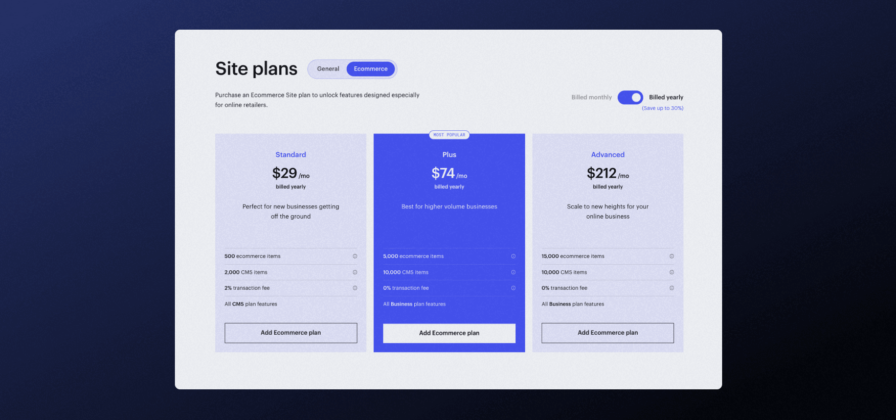
The last ecom tier is $212/month and for that, you can have 15,000 product variants/categories.
This makes Webflow ecommerce pricing a bit cheaper than Shopify.
Workplace Plans
There's an in-house team and freelancer/agency plans for workspaces in Webflow (the place where you store all your Websites).
Be prepared to pay $28-60/seat each month, depending on what features you actually need.
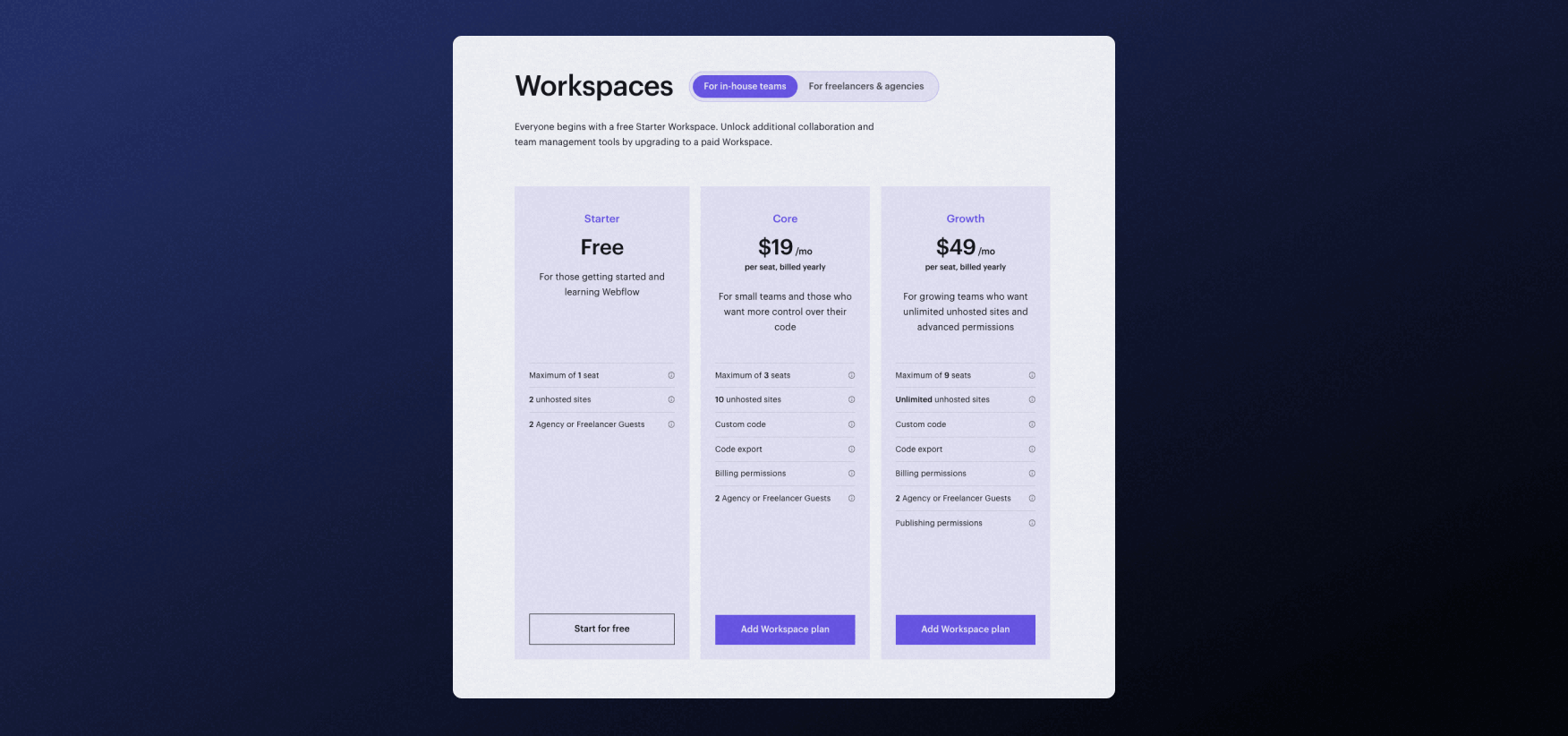
Keep in mind that most of you reading this will not need to pay this and those that will, most likely will not have an issue with these associated costs.
Combining Webflow with Other Tools
While there are so many amazing Webflow resources out there, Webflow doesn’t have an extensive marketplace like some other platforms do. Or does it?
Because Webflow is a visual website coding platform where you have complete control of your code, you don’t need an actual marketplace to integrate your Webflow website with almost any tool out there.

In most cases, it’s as simple as adding a one-line script to your code, publishing it, and it works.
When it comes to more complex, unique cases of tool integration, you might need a Webflow expert!
Webflow Experts
There are three main types of Webflow experts out there, whether it’s a solo freelancer or an agency. You might need to hire some of them, especially if you are very serious about your Webflow website.
Webflow Web Designers
Custom and unique design is what made Webflow so popular in the first place. That’s why there are so many designers that work exclusively with Webflow.
Webflow designers can create websites with or without planning in Figma. Typically, they build technically simpler sites, not complex ones requiring a team of professionals.
Webflow Web Developers
Because Webflow is a visual development tool, more complex development usually involves a Webflow developer or development team.
There are so many freelancers or agencies that specialize only in development — from rebuilding Figma files in Webflow (meaning your designer doesn't need to understand Webflow) to integrating other tools you need, to even custom APIs or other complex custom code solutions.
Webflow Digital Marketers
When it comes to Webflow website management, content marketing and SEO, you might need a team of marketing specialists to grow and maintain your website. Especially if you don’t have an in-house marketing team or your marketing team is not familiar with Webflow.
Be aware! The biggest issues can come if you do not pick a team that works exclusively with Webflow clients or even worse, a digital marketing agency that doesn’t work with Webflow and still wants to work on your website strategy.
All in One?
Like always, hiring a generalist freelancer that specializes in all 3 fields brings the risk that none of them will be appropriately executed…
Hiring a big agency that has a team of diverse professionals from all areas and has experience with massive Webflow enterprise builds, might be the way to go! Here at Flow Ninja we are your Webflow team of marketers, designers and developers!
Webflow Templates
Like with all other platforms, if your budget is tight and especially if you have plenty of time to learn and make mistakes, you can start with the Webflow website template. There are paid and free templates for most businesses.
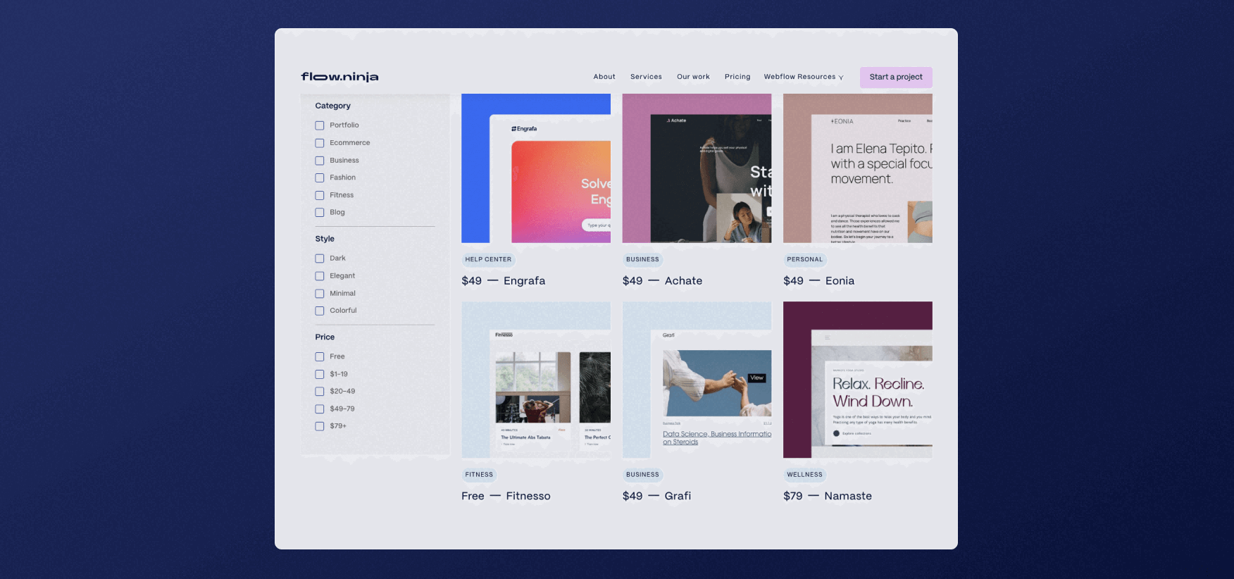
Furthermore, because you can control both code and content on your Webflow website, with some experience almost any template can be adapted to nearly any business needs.
We even have some free and paid Webflow templates that you can use, which our team developed in Webflow!
Compare Webflow
Webflow is not only one of the best WordPress alternatives — it also outperforms most other website builders out there.
Let’s see the pros and cons of using Webflow when compared to other most popular website builders out there!
Webflow vs Shopify
All other comparisons on this list will start with… hard to compare. Well, not Shopify as Shopify is the only platform that does something better than Webflow. If you need a web store that needs to ship their products.
Period.
We can use Webflow as your website and manage your store from Shopify (connect them to get best of both worlds), but Shopify was always oriented towards online sellers and Webflow is still catching up with them in the ecommerce industry.
Webflow vs WordPress
When comparing Webflow to WordPress, it’s really hard to compare the two.
WordPress is open-source and free to use… But in reality — to build similar websites on WordPress and Webflow: on WordPress, you will need to pay for plugins and services like hosting, SEO, spam protection, cache purging, and even design tools like Elementor, which are not even close to Webflow design toolset.
This will lead to non-custom design and functionality that either works (because it came from a plugin) or not… If it doesn’t — and there is no other plugin that does it better — you are stuck.
Also, WordPress plugins mess up your code, crash websites, and… Well, there is a reason why WordPress plugin updating and management agencies get paid so much.
Having a WordPress site is usually about fixing issues, while having a Webflow website is always about growing it. If you have a WordPress site and you just felt that last sentence hit hard, really give Webflow a try. It doesn’t bite… It changes everything.
Webflow vs Wix
To compare Webflow to Wix is really hard because Wix is an actual no-code builder. Meaning it has been made for non-technical people.
This also means that Wix is fast and relies on templates. For a tiny site (few pages) that doesn’t need to make money, especially if you are very very non-technical, Wix might seem like the right call.
On the other hand, if you own a real business and need that business to rank on search engines, bring in leads and convert them into customers — Webflow is the platform to choose.
The only question is should you hire a Webflow team to build it or try doing it yourself? That’s for you to answer based on time, technical and design knowledge and budget you have.
Webflow vs Squarespace
You can't actually compare Webflow to Squarespace, because Squarespace is really aimed at ease of use for non-technical people. You can compare Wix and Squarespace, but you can hardly compare any of them to Webflow.
If you don’t need a custom design, don’t need to rank on search engines and just need a tiny site you can show your friends - you can go with Squarespace.
Any business-oriented website builds should not consider Squarespace instead of Webflow, especially if they plan on growing both as a team and their revenue.
Flow Ninja Is Your Go-To Webflow Partner
If you want a professional Website built by experts, Flow Ninja is your go-to partner. Apart from designing and developing sites, the Flow Ninja team also works on maintaining your site with ongoing design, development, and optimization. Fill out a form to book a meeting.
FAQ for What Is Webflow
What types of websites can you build with Webflow?
Webflow can be used to build a wide range of websites, including marketing sites, e-commerce stores, portfolios, blogs, and enterprise platforms. Its flexibility allows designers and developers to create visually complex, fully responsive sites without relying on plugins or external templates.
Is Webflow a no-code tool or a visual code editor?
Webflow is a hybrid between a no-code tool and a visual code editor. It lets users visually design websites while automatically generating clean HTML, CSS, and JavaScript in the background. This makes it suitable for both non-coders and experienced front-end developers.
How does Webflow help marketing teams manage and update content without developers?
Webflow’s CMS allows marketing teams to edit, add, and publish content directly through a user-friendly interface. This eliminates the need for developer involvement in routine updates, speeding up content production while maintaining full design consistency and version control.

Search Historian
Search Historian is a Webflow SEO expert, Sitemap Architect and Content Strategist at Content Nest. He specializes in scalable sitemap planning and SEO optimized CMS information architecture.


.svg)

.png)
.png)
.webp)
.svg)

