

.svg)
Is Webflow Responsive Out of the Box? + Examples of Responsive Websites Built Using Webflow
Key takeaways
- Webflow makes building responsive websites easy thanks to its visual, no-code design tools.
- Responsive design in Webflow relies on breakpoints, reflowing content, and flexible sizing.
- Webflow’s Designer lets you preview and adjust layouts for every device in real time.
- Responsive sites improve UX, SEO, conversions, and overall site performance.
- Templates, flexbox, mobile-first planning, and careful CTA placement help you achieve better responsiveness.
- Webflow’s tools, hosting, and CMS make it simple for teams to design, test, and maintain fully responsive sites.
Building a responsive website has become paramount nowadays, as the number of users who don’t access websites via desktop PC is increasing rapidly. A responsive website can adapt to different screen sizes without compromising its design, structure, and overall effectiveness.
Webflow responsiveness has been one of the best in the entire web design and development industry. More importantly, building responsive websites with Webflow has never been easier, as no-code web design makes it easy and enjoyable. In other words, you don’t have to know any HTML or CSS to create a responsive website using Webflow site-building tools.
As such, Webflow helps developers and non-technical users, experience what it means to build a website using an intuitive user interface. Building a website with Webflow can be entirely visual, with no lines of code written. More importantly, you can immediately see the design changes.
{{cta}}
Responsive Designs Elements
Despite not requiring code, a responsive Webflow site will still require you to understand how responsiveness works, to begin with. Here are the four critical aspects of responsive design to take into account:
- Reflowing content — Presenting content on the site on different screen sizes without it losing functionality or information.
- Fixed sizing — Objects on the site will have the same pixel width, no matter the screen size.
- Relative sizing — Objects on the site will change their size to the screen size.
- Breakpoints — Building blocks of responsive design that are used to determine points at which the content and design will adapt to another screen size.
Webflow Breakpoints: Building Blocks of Responsive Design
Webflow breakpoints are the foundation for crafting responsive websites within the Webflow platform. They act as invisible lines drawn across the screen width, dictating how your website's layout and design adapt to different device sizes. Imagine them as checkpoints where your website undergoes a transformation to fit the specific screen dimensions of a desktop, tablet, mobile landscape, or mobile portrait view.
Here's how Webflow breakpoints empower you to achieve responsive design:
- Visualizing screen size changes — Webflow Designer displays your website alongside a set of breakpoint icons representing various devices. Clicking and dragging these icons allows you to see how your design adjusts across different screen widths in real-time. This provides a clear visual understanding of how elements will behave on different devices.
- Setting breakpoint-specific styles — Webflow allows you to define unique styles for each breakpoint. For instance, you might decide to change the layout from a three-column grid on a desktop to a single column on a mobile portrait. You can adjust font sizes, margins, and element visibility to ensure an optimal user experience across all screen sizes.
- Optimizing content flow — Breakpoints help you manage how content reflows on your website. By strategically defining breakpoints, you can prevent essential information from getting cut off or appearing cluttered on smaller screens. You can choose to hide specific elements on certain breakpoints or rearrange them for better readability.
Here are some additional tips for using Webflow breakpoints effectively:
- Start with a mobile-first approach — With the rise of mobile browsing, it's wise to design for smaller screens first. This ensures a solid foundation that adapts to larger devices.
- Utilize the default breakpoints — Webflow provides a good starting point with pre-defined breakpoints for desktop, tablet, mobile landscape, and mobile portrait. You can customize these or add new breakpoints for more granular control.
- Test, test, test — Responsive design is an iterative process. Use Webflow's preview mode and browser developer tools to thoroughly test your website across various devices and screen sizes. Refine your breakpoints and styles based on your testing to achieve optimal responsiveness.
You can achieve the same level of sophistication across all devices when designing a responsive website with Webflow and will have to use little to no code in the process. Responsiveness is an integral part of the no-code approach cultivated by Webflow, which means you’ll always design responsive websites whenever you start a project in Webflow.
.png)
Why Have a Responsive Website
A responsive website has become an industry standard, and there are many reasons for that. I’ve gathered some of the most important ones. Let’s take a look at them.
- Better user experience — Responsive design ensures a seamless and user-friendly experience on all devices.
- Cost-effective option — One responsive website saves time and resources compared to building separate versions.
- Better visibility — Responsive sites rank higher in search results, increasing visibility to potential visitors.
- Ease of management — Managing one responsive site is simpler and ensures consistent content.
- Higher conversion rates — Easy access to content leads to increased conversion rates (provided that you have high-quality content optimized for driving conversions).
- Generates more traffic — Responsive design attracts a broader audience, increasing site traffic.
- Future-proofing — Responsive sites adapt to new devices and technologies.
- Improved SEO performance — Consistent design across devices enhances SEO rankings.
- Positive brand impression — A professional, user-centric site builds trust and credibility.
{{cta}}
Building a Responsive Website with Webflow
Designing a responsive site using Webflow isn’t rocket science — but it isn’t a walk in the park either. The main piece of advice for new designers who decide to use Webflow is to understand that it’s the width of the screen that changes, so they have to pay attention to how the content is repositioned based on the browser width of the device visitors will use.
You can check this right away. Restore down your browser window if you’re on your desktop computer or laptop and start decreasing its width gradually. At one point, you’ll see how the elements on our site will reposition. That’s responsiveness.
Here are some other important tips you need to take into account if you want to design a responsive website with Webflow.
- Start from scratch or use Webflow templates — Starting from scratch is a great way to explore options, but it takes time. If you want to kickstart your designing journey, you should pick a template, as the majority of templates have responsiveness already figured out.
- Plan before you design — It’s important to have an idea of how you want your content on the website to be structured even before you decide to open Webflow Designer. This will help you organize it better for smaller screens.
- Keep an eye on the navigation — When designing for small scenes, you cannot add comprehensive navigation with dozens of choices. Instead, try using in-page links, collapsible menus, dropdowns, and icon-text pairs to make navigation more intuitive for small screens.
- Position your CTA buttons carefully — Apart from your CTA button standing out in both color and size, it’s essential to provide some space around it to avoid possible misclicks as people who use smartphones and tablets sometimes fail to hit the right button right away.
- Use the power of flexbox for even better responsiveness — The popular CSS3 layout mode ensures that sites are highly flexible to different screens. Webflow’s flexbox builder can help you understand how it works and how to use it to maximize the responsiveness of your website.
.png)
Responsive Webflow Websites
Most websites built with Webflow are responsive, but some are better than others. You can open any such site on your phone and see if the designers and developers did a good job of making the site at hand responsive.
We at Flow Ninja pay particular attention to the responsiveness of every website we make. Here are some of the finest examples. Feel free to test them.
- Folklore — Folklore is the official representation of venture capital from Australia. It consists of a team of startup operators, founders, and investors, who are seeking opportunities to back promising projects.
.png)
- Upwork — The marketing site for Upwork transitioned from WordPress to Webflow due to the easy maintenance process offered by Webflow. In addition to that, the marketing site is extremely responsive. Here’s our case study on it.
.png)
- Simple Club — The Berlin-based platform focusing on e-learning works smoothly on both desktop and mobile devices, especially after the Flow Ninja team completely re-thought the website’s architecture. Read more about it here.
.png)
- Enjin — Enjin is a gaming-focused online NFT marketplace, creating the basis for web3 and the metaverse. Our team made sure that its website was fully responsive and working smoothly across devices.
.png)
- Smart Suite — This is the official website for a comprehensive work management platform.
.png)
Also, if you’re seeking resources for your responsive website, make sure to check our list of the best resource sites for Webflow.
How to Test for Responsiveness in Webflow
Testing for responsiveness is actually pretty straightforward. You can do it from Webflow Designer as you build your website. Designer even allows you to re-arrange your elements while you’re in mobile mode, streamlining responsive designing.
Once your Website is live, you can test responsiveness for different devices from your browser. Here’s how to do it if you’re using Google Chrome:
1. Right-click anywhere on your page and select Inspect.

2. A new window with code for your site will appear at the side or the bottom of your screen. In the top menu of that window, find an icon depicting a phone and a desktop computer, as shown in the picture below.
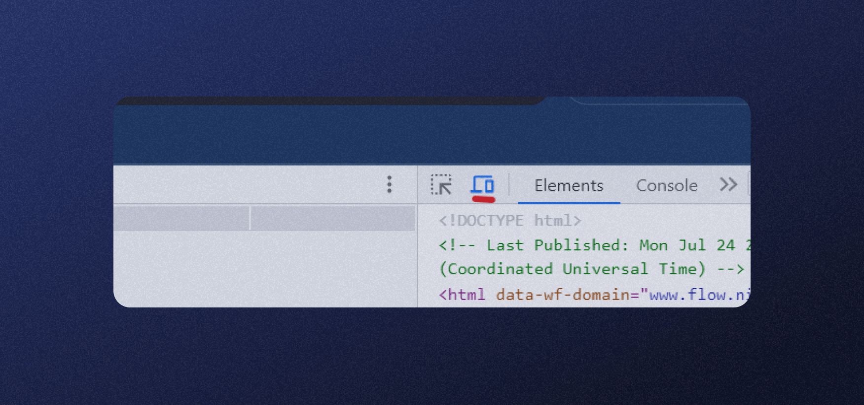
3. You’ll see your page resize, but you can choose one of the options to further change the screen ratio as presented on different devices. Take a look at the picture below.

Best Practices for Responsive Design
Let’s check out what you should pay attention to when designing your site's responsive design. I’ll also provide quick tips for each step, but bear in mind that these are general fixes and that each site is different and may require a more specific approach.
1. Focus On Your Navigation
Navigation plays a crucial role in the responsiveness of your design. Intuitive and user-friendly navigation ensures visitors can easily explore your site on any device.
Tips to Improve Website Navigation:
- Use a clear and concise menu structure.
- Implement a "hamburger" menu for mobile devices to save space.
- Prioritize essential navigation links and declutter secondary options
2. Have a Mobile-Friendly Design
With the significant increase in mobile users, a mobile-friendly design is vital for responsiveness. It ensures your site adapts and looks great on various mobile devices.
Tips for a good mobile-friendly design:
- Use responsive layouts that adjust to different screen sizes.
- Optimize images and media for faster loading on mobile devices.
- Implement touch-friendly elements, such as larger buttons.
3. Use Call-to-Action Buttons
Call-to-action buttons are critical for guiding visitors to take desired actions, such as signing up or making a purchase.
Some of the common mistakes with CTAs include:
- Inadequate size makes them hard to notice.
- Overusing CTA buttons can confuse visitors.
- Not optimizing CTA buttons for touch, making them difficult to tap on mobile devices
Tips for effective CTAs:
- Make CTA buttons stand out with contrasting colors.
- Use clear and action-oriented text on the buttons (e.g., "Get Started," "Buy Now").
- Avoid cluttering the page with too many CTAs.
4. Be Specific with Your Words
While you can add numerous words to your website, clarity is crucial for responsiveness. Provide relevant information in a concise and easily accessible manner.
Tips for specific messaging:
- Use headings and subheadings to organize content.
- Break content into short paragraphs for easy scanning.
- Utilize bullet points and lists to present information clearly (just like I did here).
5. Embrace Negative Space
Negative space, or white space, is the empty area around and between design elements. It is essential for creating a clean, balanced, and responsive layout.
Tips for using negative space:
- Avoid overcrowding elements; give them room to breathe.
- Use negative space strategically to direct attention to important content.
- Balance content and white space for an aesthetically pleasing design.
Why Choose Webflow?
Once you embrace the idea that people will use different devices to explore your website, you’ll understand why responsiveness has become a vital part of the web design process. With no coding required, Webflow can make you visual wonders that will help you achieve goals and reach your target visitors, whether they’re using a tablet, a smartphone, or a desktop computer.
Despite that, making a Webflow site that works perfectly on all devices requires understanding the nature of responsiveness and coming up with the best possible solution. That still doesn’t require code, but having a Webflow expert’s assistance is a good idea. If you need a team of professional Webflow designers and developers, feel free to contact Flow Ninja and let us know how we can help you.

{{cta}}
Frequently Asked Questions
How to make Webflow design responsive?
Webflow automatically takes responsiveness into account, meaning you’ll design a responsive website as soon as you start using Webflow Designer.
How to turn on responsive images in Webflow?
As soon as you upload an image to Webflow to use on your site, Webflow will create different size variations automatically to ensure that the image will land on any device. This can increase the loading time of a website by up to 10 times.
How to make a responsive layout in Webflow?
Essentially, you have to pay attention to reflowing content, fixed and relative sizing, and breakpoints as a basis for making a responsive site.
FAQ for Webflow Responsiveness
What are the key advantages of building a responsive website with Webflow instead of traditional coding?
Webflow offers a visual, no-code workflow where responsiveness is built in by default. Designers can adjust layouts per breakpoint, preview changes in real time, and rely on auto-generated responsive images, reducing development time, maintenance costs, and dependency on front-end engineers for typical layout changes.
How should I structure my breakpoints in Webflow for the best responsive results?
Begin with a mobile-first approach, designing for the smallest breakpoint and scaling up. Use Webflow’s default desktop, tablet, mobile landscape, and mobile portrait breakpoints, adding custom ones only when necessary. Adjust typography, spacing, and layout per breakpoint to maintain clarity and usability.
What is the difference between fixed and relative sizing in Webflow, and when should each be used?
Fixed sizing uses set pixel values, keeping elements identical across screens, which suits logos or small icons. Relative sizing uses percentages, viewport units, or flexbox, allowing elements to scale with screen width. For responsive layouts, prioritize relative sizing and reserve fixed sizing for constrained components.
How can I optimize navigation in a Webflow site for smaller screens?
Use concise menu structures and convert full-width navigation into a hamburger or collapsible menu on tablet and mobile breakpoints. Prioritize core links, move secondary items into submenus, and ensure tap-friendly spacing so users can easily select items without accidental clicks on touch devices.
What are best practices for creating effective mobile CTAs in Webflow?
Design CTAs with contrasting colors, clear action verbs, and sufficient padding for comfortable tapping. Place primary CTAs above the fold and near key content sections. Avoid stacking too many CTAs on one screen to reduce cognitive load and prevent users from missing the main action.
How can I test Webflow site responsiveness beyond the Designer preview?
After publishing, open the site in a browser like Chrome, use Inspect and toggle device emulation to simulate common screen sizes. Combine this with testing on real devices where possible, checking typography, spacing, navigation, and interactive elements for usability on each viewport.
How does having a responsive Webflow site impact SEO and conversions?
Responsive Webflow sites provide consistent experiences across devices, which supports better engagement metrics, lower bounce rates, and improved Core Web Vitals. These signals contribute to stronger SEO performance, while clearer layouts, fast loading, and optimized CTAs typically increase lead generation and sales conversions.

Uros Mikic
Since 2015, Uros has mastered Webflow, developing everything from full games to enterprise solutions. His expertise led to the creation of Flow Ninja, aimed at using Webflow to help clients scale their businesses and accelerate growth.


.png)


.webp)


.svg)

.png)
.png)
.webp)
.svg)

