

.svg)
The Ultimate Landing Page Checklist to Maximize Conversion
Key takeaways
- A consistent landing page structure (hero, problem, solution, proof, FAQ, footer) boosts conversions.
- Strong copy starts with a clear persona, sharp value proposition, and benefit-driven, skimmable headlines.
- Good UX relies on focused navigation, clean visuals, responsive design, and frictionless forms and CTAs.
- Technical SEO basics such as speed, mobile friendliness, clean URLs, sitemaps, and redirects must be included early.
- On-page SEO with keywords, titles, headings, and internal links strengthens both paid and organic performance.
- Use the checklist flexibly, focus on essentials first, then refine using testing and analytics.
After building hundreds of landing pages for Flow Ninja and our clients, my team and I created an in-house checklist that we decided to share with the world.
By sticking to this formula, we managed to build and launch pages via Webflow, and some of these pages are making $100,000+ in revenue alone.
This checklist is a product of dev, designer, sales, marketing, project management, and QA teams working together, incorporating all possible angles.
We needed an all-in-one reminder that we covered it all: from design to SEO to conversion rate optimization.
The checklist covers:
- The landing page structure
- The copy
- The user experience
- The SEO
This comprehensive guide is more than just a checklist; it's a roadmap to unlocking the true potential of your landing pages.
Before we begin, I just wanted to share the YT video I made that covers this topic. Check it out below:
Now, let’s jump straight to the checklist.
If it seems like too much info at once — don’t worry! I included a “How to Use” section below the checklist that will teach you how to organize and utilize the information from the checklist to ensure you properly incorporated all items for maximum outcome.
{{cta}}
The Landing Page Structure Checklist
First, let’s make sure that your landing page has a structure that doesn’t confuse the user but retains their attention and converts them.

1. The Basic Page Structure
Ensure the landing page follows a logical flow with a clear hierarchy:
- Hero section (grabs attention)
- Problem section (establishes need)
- Solution section (presents your offer)
- Social proof section (builds trust and credibility)
- Pre-footer with CTA (promotes action)
- FAQ section (addresses common questions)
- Footer (provides contact information and legal links)
We found out that this structure is what works best when building landing pages. While this is not set in stone, illogical order might interrupt the flow and confuse the user.
To come up with a wireframe for your page following this structure, it’s important to use a good wireframing tool.
Below, I will briefly go over some of the most common things to pay attention when it comes to the structure, and some of them will be explained in more detail as you scroll through the checklist.
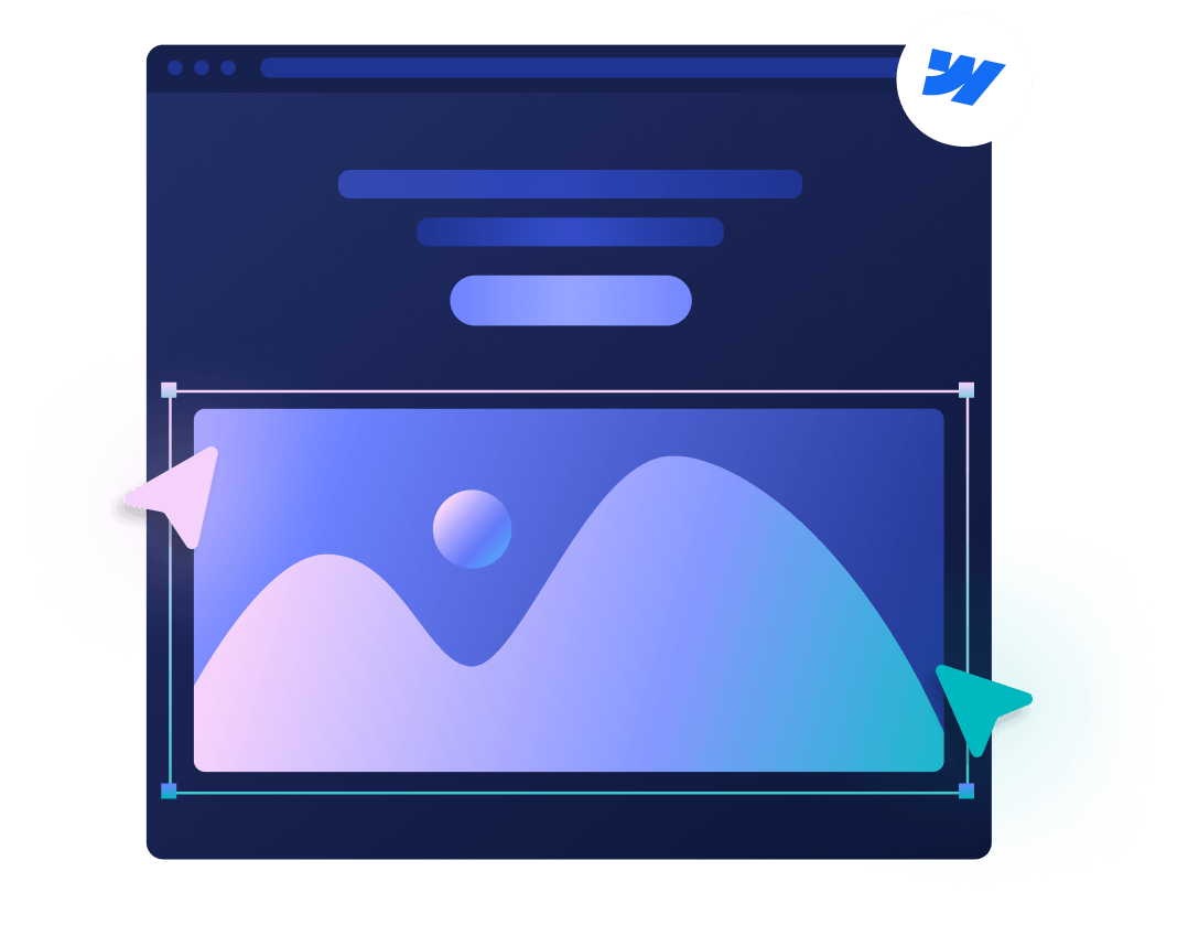
1.1 Hero Section
- Compelling headline: Grabs attention and communicates your value proposition.
- Benefit-oriented subheading (optional): Briefly expands on the headline's benefit.
- High-quality visual: Eye-catching image or video relevant to your message.
- Clear call to action (CTA): Prompts visitors to take action (e.g., "Download Now," "Learn More")
1.2 Problem Section
- Target audience's pain points: Clearly identify the challenges your ideal customer faces.
- Problem description: Explain how the pain point impacts their life or business.
- Emotional connection (optional): Use language that evokes emotion to resonate with the audience. This only works for certain industries.
1.3 Solution Section:
- Introduce your product/service: Position it as the solution to the problems you highlighted.
- Explain key benefits: Focus on how your offering solves the user's challenges and improves their situation.
- Highlight unique selling propositions (USPs): Differentiate yourself from competitors by mentioning what sets you apart.
1.4 Social Proof Section:
- Testimonials: Include quotes from satisfied customers praising your product/service.
- Reviews: Showcase positive reviews from trusted platforms like Google or Trustpilot.
- Logos: Feature logos from well-known brands or companies you've worked with.
- Data & statistics (optional): Use numbers to showcase the effectiveness of your solution.
1.5 Pre-footer with CTA
- Strong and visible CTA button: Use contrasting colors and clear action verbs.
- Sense of urgency: Create a sense of urgency with limited-time offers or scarcity tactics.
- Benefit-oriented CTA copy: Briefly reiterate the benefit users gain by taking action.
1.6 FAQ Section
- Address common questions: Anticipate what visitors might ask and provide clear answers.
- Concise and informative answers: Keep explanations brief and easy to understand.
- Organized format: Use bullet points or accordion menus for easy navigation.
1.7 Footer
- Contact information: Include email address, phone number (if applicable), or live chat option.
- Copyright notice: Display the copyright year.
- Links to legal pages: Provide links to your privacy policy and terms of service.
- Social media links (optional): Include links to your social media profiles.
2. Checking for Usual Structure Mistakes
- Extensive menus: Landing pages typically don't need elaborate navigation menus. They should be laser-focused on a single goal, so excessive navigation options can distract visitors and lead them away from the desired action (CTA).
- Unnecessary links: Avoid including links to other parts of your website on the landing page. Keep the focus on the specific offer or conversion you're aiming for.
- Jumbled information: Ensure a logical flow of information with clear transitions between sections. Don't jump from problem to solution abruptly.
- Missing transitions: Use headers, subheadings, and visuals to guide the user's eye and create a clear path towards the CTA.
- Text walls: Avoid overwhelming visitors with large blocks of text. People scan landing pages, so prioritize concise and scannable content.
- Information overload: Focus on the most important information that directly relates to your value proposition and the user's need.
The Landing Page Copy Checklist
The copy is what sells. It’s the first thing the visitor sees and the last thing they read before smashing that CTA button.
In the following section, I will reiterate and expand some of the things I mentioned in the first part, and add new items to ensure this checklist is as comprehensive as it gets.
Here’s the checklist for your page copy.

3. Creating Customer Persona
Before writing your copy, it’s a good idea to come up with a customer persona and have an in-depth understanding of who you are writing the copy for. That’s why we decided to include a checklist for it as well.
But before that: explore different tools and templates for building your personas.
3.1 Gather Customer Insights
- Research: Analyze market research reports, industry trends, and competitor data to understand your target audience. Use tools like Google Trends, SEMRush, and Google Anallytics for research.
- Customer Data: Utilize existing customer data (website analytics, surveys, CRM) to identify patterns and trends in demographics and behavior. Use GA4 in combination with CRM tools such as Hubspot, Salesforce, and Mailchimp.
- Direct Engagement: Conduct surveys, interviews, or focus groups to gather firsthand information about their needs, challenges, and behaviors. Tools like Google Forms and Typeform can help with this.
3.2 Define Core Demographics
- Identify key characteristics: Age range, location (optional), occupation (optional), income level (optional).
3.3 Understand Needs & Challenges
- Needs: Pinpoint the core needs and desires your product or service addresses.
- Challenges: Identify the specific problems your ideal customer faces in their daily lives or work.
3.4 Uncover Values & Motivations
- Values: Understand what values are important to your target audience (e.g., convenience, quality, affordability).
- Motivations: Discover what motivates their purchasing decisions (e.g., solving a problem, improving their life, social status).
There are no specific tools for needs, challenges, values and motivations. Use ChatGPT and Google to get ideas. Ideally, you just need to talk to people — perhaps your existing customers — so Zoom or Google Meet will do the job.
3.5 Develop a Persona Profile
- Craft a name and persona (optional): Assign a name and potentially a picture to personalize your customer profile.
- Map their buyer's journey: Outline the typical steps your persona takes when considering a purchase in your product category. Use simple sticky note apps to keep track of this. If things get complicated, use good flowchart tools.
4. Headline & Value Proposition
- Keep it short and sweet: Aim for around 5-8 words for optimal readability.
- Clear value proposition: Communicate the benefit your product or service offers in a concise way.
- Easy to understand: Avoid jargon or technical terms your target audience might not understand.
- Focus on benefits, not features: Highlight how your product/service solves a problem or improves the user's life.
- Target audience's needs: Tailor your headline to address the specific pain points and desires of your ideal customer.
- Quantify benefits (optional): If possible, use numbers or data to quantify the value you offer (e.g., "Double Your Sales in 30 Days").
- Strong verbs: Use action verbs to intrigue.
- Curiosity factor: Spark curiosity with a question or a surprising statement to entice readers to learn more.
- Urgency (optional): Create a sense of urgency with limited-time offers or scarcity tactics (e.g., "Last Chance Offer!").
To get the most from headlines, either:
- Hire a professional copywriter.
- Find a good copywriting course.
- Don’t forget to leverage AI, using the items provided in the checklist. Check this list for useful ChatGPT prompts for writing copy.
5. Content & Readability
- Keep it concise: People scan landing pages, so use short paragraphs, bullet points, and clear subheadings.
- Readability matters: Use simple, easy-to-understand language. Avoid jargon and technical terms. Tools like Hemingway Editor can help you with this.
- Action-oriented language: Motivate visitors to take action with verbs like "download," "sign up," or "learn more."
- No fluff: Eliminate unnecessary words, phrases, or content that doesn't directly contribute to conveying your message or persuading users to take action. Grammarly can help with this.
- Asking questions: Strategically use questions to engage your audience, spark their curiosity, and encourage them to explore further.
6. Trust & Credibility
- Social proof: Include testimonials, reviews, or logos from trusted brands to build trust and credibility. Of course, you first need to collect those. Google has some useful tips for this. Additionally, you can use some of the proven strategies to get testimonials.
- Data & statistics: Use numbers or data to back up your claims and showcase the effectiveness of your product/service.
7. Matching Language
- Match landing page copy to ad copy: Ensure consistency between the message in your ad and the message on your landing page. The user who stumbles upon your ad on Google or anywhere else needs to make sure that the language and the messaging are the same.
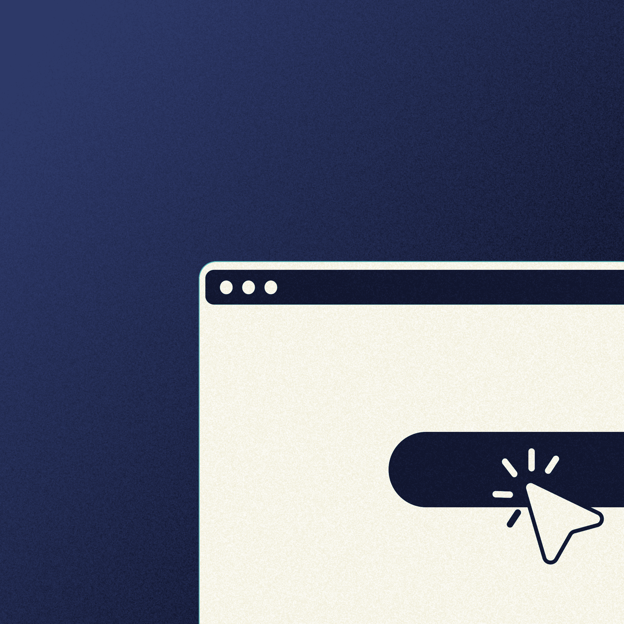
8. CTA Copy & Urgency
- Strong action verbs: Use verbs like "Download," "Sign Up," or "Start Now" to clearly communicate the desired action.
- Benefit-oriented: Frame the CTA around the benefit users receive by taking action (e.g., "Get Your Free Trial").
- Visually distinct: Make the CTA button stand out with contrasting colors and clear design.
- Above the fold: Place your primary CTA prominently within the initial viewport to capture immediate attention.
- Multiple CTAs (optional): Consider including secondary CTAs throughout the page to reinforce the call to action. Please take into account that this is not a secondary CTA, and it’s by no means different in terms of what the user needs to achieve by clicking on it. It’s the same CTA located on other parts of the page. Apart from the hero section, we usually add it once again in the pre-footer.
- Mobile-friendly: Ensure CTAs are easily clickable and optimized for all devices.
- Test different CTAs: Experiment with variations in CTA copy, button design, and placement to see what resonates best with your audience. Use A/B testing and monitor click-through rates (CTRs) to identify the most effective CTAs. Optibase is a great A/B testing tool, exclusive to Webflow.
SEMRush created a great blog featuring examples of great CTAs, and so did Hubspot.
I compiled a set of tactics I labeled all as optional, as these are sometimes great to use, but not always. See what works best for your offer.
- Limited-time offers (optional): Create a sense of urgency with limited-time discounts or promotions (e.g., "Offer Expires in 24 Hours").
- Scarcity tactics (optional): Highlight limited availability to encourage immediate action (e.g., "Only 10 Spots Left!").
- Progress bars (optional): Use progress bars to visually represent limited time or quantity remaining.
- Guarantee (optional): Offer a money-back guarantee or satisfaction guarantee to reduce perceived risk and encourage action.
- Social proof (optional): Showcase various testimonials or logos from trusted brands who are your clients near the CTA. This builds trust and credibility.
- Bonus incentives (optonal): Offer additional benefits for acting promptly, increasing perceived value and motivating users to convert.
- Exclusivity (optional): Creates a sense of special access or privilege for those who act early, increasing the perceived value of the offer.
9. Formatting & Skimmability
- Images, videos and animations: Integrate high-quality images, infographics, or short videos and animations to break up text walls and add visual interest. If you don’t have a dedicated designer, consider using tools like Canva or DepositPhotos.
- H1, H2, H3 tags: Structure your content using clear headings (H1) and subheadings (H2, H3) to guide the reader's eye and create a logical flow.
- Scannable: Keep headings concise and informative to allow for quick comprehension.
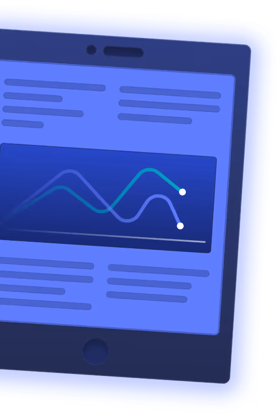
- Charts & graphs (optional): Use charts or graphs to represent complex data in an easily digestible way.
The User Experience Checklist for Landing Pages
A landing page could have killer copy, but poor experience can divert users from scrolling past the hero section. It’s important to navigate the user to the CTAs with your overall experience, and here’s a list of points on how to do that when building a landing page.

9. Design & Visuals
- Cohesive visual style: Maintain a consistent visual style throughout the page, including colors, fonts, and imagery.
- Visual hierarchy: Use the size, placement, and color of elements to guide the user's eye towards important information and the CTA.
- White space: Utilize white space effectively to create a clean and uncluttered layout that improves readability.
- Hero image/video: Grab attention with a powerful hero image or video that showcases your product/service or its benefits.
- Mobile responsiveness: Ensure your landing page design and visuals adapt seamlessly to all devices (desktop, mobile, tablet).
For all of this, it’s important to hire professional designer and developers and stick to powerful builders, such as Webflow.
10. Usability & Navigation
- Limited navigation options: Avoid cluttering the landing page with excessive navigation menus.
- Focus on the goal: Prioritize the primary action you want users to take (e.g., signing up, making a purchase).
- Clear labeling: Use clear and concise labels for any navigation elements that are present.
- Minimize form fields: Only request information essential for your conversion goal.
- Clear instructions: Provide clear instructions or tooltips for each form field.
- Error handling: Implement clear and user-friendly error messages for invalid input.
- Clear CTA: Use a prominent and visually distinct button for the primary call to action.
- Benefit-oriented text: Frame the CTA button text around the benefit users receive by taking action.
- Mobile-friendly: Ensure buttons are easily clickable and sized appropriately for all devices.
11. Accessibility
Accessibility is an important part for both experience and SEO. I will share just some of the items that I consider crucial here, but you will find other accessibility items scattered throughout design and SEO sections of this page.
Google Lighthouse has remained, for me, one of the best tools for testing accessibility, but you can check other popular options here.
11.1 Keyboard Navigation
- Focus indicators: Clearly indicate which element has focus when using the keyboard to navigate the page.
- Tab order: Ensure a logical tab order allows users to navigate through the page elements in a predictable sequence using the keyboard.
- Skip links (optional): Provide skip links to allow users to jump directly to the main content area, bypassing repetitive navigation elements.
11.2 Screen Reader Compatibility
- Semantic HTML: Use semantic HTML elements (headings, lists, tables) to structure your content and convey meaning to screen readers.
- Alternative text (alt text): Provide clear and descriptive alt text for all images, explaining the image content for visually impaired users.
- ARIA attributes (optional): Utilize ARIA attributes to provide additional information about interactive elements and their functionality for screen readers.
11.3 Color Contrast
- WCAG guidelines: Follow WCAG (Web Content Accessibility Guidelines) recommendations for sufficient color contrast between text and background.
- Contrast checkers: Use online contrast checkers to ensure your text meets the minimum contrast ratio for readability.
11.4 Font Size
- Minimum size: Maintain a minimum font size that is easily readable for most users.
- Scalability: Allow users to adjust the font size through browser settings to cater to individual needs.
The SEO Checklist for Your Landing Page
Many landing pages aren’t built with SEO in mind, simply because they are not optimized for organic traffic. In most cases, there are other channels that people use to bring relevant users to their landing pages.
But the truth is: doing good SEO and letting search engines crawl your page can only bring benefits.
In most cases, doing proper technical SEO is also in line with good user experience and accessibility practices.
That’s why I recommend going through the following SEO checklist items carefully.

12. Technical SEO
Technical SEO ensures your landing page is properly structured and crawlable by search engines, improving its visibility in search results. Here's a checklist to optimize your landing page for technical SEO:
12.1 Page Speed Optimization
- Fast loading times: Aim for a fast loading speed (ideally under 3 seconds) to improve user experience and search engine ranking. Use Lighthouse to test speed and performance.
- Image optimization: Optimize image sizes and formats to reduce file size without compromising quality. Use free online tools for image compression.
- Minification & caching: Minify code and leverage browser caching to improve page load speed. Use Webflow’s easy minification toggle if you’re on this platform.
12.2 Mobile Responsiveness
- Mobile-first indexing: Ensure your landing page is mobile-friendly as Google prioritizes mobile-friendly pages in search results. Learn how to simulate different mobile environments via your browser.
- Responsive design: Use a responsive design that adapts seamlessly to all devices (desktop, mobile, tablet). Use builders like Webflow to maximize on responsiveness.
- Mobile testing tools: Utilize Lighthouse to identify and address any mobile usability issues.
12.3 Schema Markup (optional)
- Rich snippets: Implement schema markup to provide search engines with additional information about your content, potentially leading to richer snippets in search results. Use Google’s Rich Snnippets test tool to see how your snippet looks on Google.
- Structured data types: Use relevant structured data types like "Product" or "Event" to enhance the way your landing page is displayed in search results. Learn more about schema markup and why structured data matters.
12.4 URL Structure
- Clear and descriptive: Use clear and descriptive URLs that include relevant keywords but avoid keyword stuffing.
- Readable format: Maintain a readable URL format with hyphens separating words.
12.5 Internal Linking
- Link to relevant pages: Include internal links to other relevant pages on your website to improve website navigation and distribute link equity. Use Google Search Console to see which of other pages are good performers and whether you need to link to them.
- Link to the landing page: Make sure that you have enough links from other pages to the landing page you launched to give it more link equity. Use tools like Screaming Frog to visualize your pages and how they are interlinked.
- Contextual anchor text: Use relevant keywords as anchor text for internal links.
12.6 Technical SEO Audits
- SEO audit tools: Utilize SEO audit tools to identify technical SEO issues on your landing page.
- Manual checks: Perform manual checks for broken links, missing meta description or title tag, and other potential technical issues.
12.7 Sitemap & Robots.txt
- Add to sitemap: Add the landing page to the sitemap to ensure efficient crawling and indexing.
- Robots.txt: Verify that your robots.txt file does not accidentally block search engine crawlers from indexing your landing page.
13. On-Page SEO
- Relevant keywords: Target keywords that users are likely to search for when looking for a product or service like yours.
- Strategic placement: Integrate your target keywords naturally throughout the landing page content, including the title tag, meta description, headings, and body copy.
- Keyword density (optional): Avoid keyword stuffing. Maintain a natural keyword density while ensuring the content remains informative and engaging.
- Unique and informative: Craft a clear and concise title tag (ideally under 60 characters) and meta description (around 160 characters) that accurately reflects the landing page content and entices users to click.
- Keyword inclusion: Incorporate your target keywords naturally within the title tag and meta description.
- Structure your content: Use clear and descriptive H1, H2, and H3 tags to structure your content, improve readability, and indicate the hierarchy of information.
- Keyword inclusion (optional): Consider including relevant keywords within your header tags.
The best tool for this is SEMRush.
14. Off-Page SEO (Optional)
While on-page SEO focuses on optimizing your landing page itself, off-page SEO deals with external factors that influence your website's search engine ranking and online visibility.
This is not necessary to check during the initial launch of your landing page. It’s a long-term game that will gradually increase your ranking based on your page’s authority. Therefore, you can use this checklist only if you decide to pursue this SEO initiative.
Here's a checklist for effective off-page SEO:
- High-quality backlinks: Acquire backlinks from reputable websites relevant to your niche. Backlinks act as votes of trust from other websites, indicating valuable content and improving your search engine ranking.
- Guest blogging: Contribute guest articles to relevant websites with high domain authority. This allows you to showcase your expertise, reach a wider audience, and potentially earn backlinks to your landing page.
- Encourage brand mentions: By actively participating in online communities, forums, and social media discussions relevant to your industry, you can encourage brand mentions, provide valuable insights, and establish yourself as a thought leader, leveraging the vast audience of over 5.04 billion people worldwide who use social media as of 2024.
- Respond to online reviews: Address both positive and negative reviews promptly and professionally. Demonstrating responsiveness builds trust and strengthens your brand reputation.
- Media outreach: Build relationships with journalists and bloggers in your industry. Secure media mentions or product reviews to gain wider exposure and potential backlinks.
- Claim your business listings: Ensure your business information is accurate and consistent across relevant online directories and listing websites.
One of the tools that’s considered the leader for off-page SEO is Ahrefs.
How to Use This Checklist?
This comprehensive checklist equips you to craft a high-converting landing page, but remember, it's a flexible roadmap, not a rigid rulebook.
Here's how to navigate and prioritize the elements:
- The Essential: Certain elements are fundamental for every landing page. These include compelling copy, clear value proposition, strong call to action (CTA), mobile responsiveness, and fast loading speed. Focus on getting these core aspects right first.
- The Important: Additional elements like A/B testing, social proof, and in-depth SEO optimization significantly enhance your landing page's effectiveness. While crucial, they can be implemented progressively.
- The Optional: Some advanced features like heatmaps or off-page SEO, provide valuable insights but might not be necessary for every landing page, especially in the initial stages.
Consider your specific industry and target audience. Elements like the level of technical SEO required might differ depending on your niche.
Align your checklist usage with your campaign goals.
A simple lead capture form might suffice for initial brand awareness, while a complex product launch might necessitate a more comprehensive approach — and a more complex site than a single landing page.
Key points to remember:
- Use your judgement: While the checklist provides a valuable framework, critical thinking is essential. Analyze your specific needs, resources, and campaign goals to determine which elements deserve the highest priority.
- Start strong, iterate often: Focus on getting the core landing page elements right initially (copy, structure, CTA). As you gather data and gain insights, gradually incorporate additional elements and optimize your page for better performance.
- Data-driven decisions: Don't solely rely on assumptions. Utilize A/B testing and website analytics to identify which elements resonate most with your audience and continuously refine your landing page based on data.
Remember: This checklist is a starting point to empower you to create high-performing landing pages. By understanding the varying importance of elements, tailoring the approach to your specific needs, and using your judgment, you can craft landing pages that effectively convert visitors into leads or customers.
Frequently Asked Questions
What is the ideal structure for a high-converting landing page?
A high-converting landing page typically follows a clear sequence: hero, problem, solution, social proof, pre-footer with CTA, FAQ, and footer. This order guides visitors from awareness to trust and action, reducing confusion and keeping focus on a single primary conversion goal.
How should I write headlines and value propositions for my landing page?
Headlines should be 5–8 words, benefit-driven, and easy to understand. Clearly state what users gain, avoid jargon, and focus on solving a specific problem. Support the headline with a concise subheading that clarifies the value proposition and reinforces why visitors should act now.
How do I create landing page copy that matches my ads and improves conversions?
Align your landing page messaging, keywords, and offers with the ad that brought users there. Mirror core phrases, pain points, and promised benefits. This message match reassures visitors they are in the right place, reduces bounce rates, and increases the likelihood of completing the CTA.
Which UX and design elements have the biggest impact on landing page performance?
Consistent visual style, clear visual hierarchy, ample white space, and mobile-responsive layouts significantly improve performance. Prioritize prominent, benefit-focused CTAs, minimal navigation, and short forms. These elements reduce friction, make content scannable, and guide users smoothly toward conversion actions.
What are the most important technical SEO steps for a landing page?
Key technical SEO tasks include optimizing page speed, ensuring full mobile responsiveness, using clean descriptive URLs, and adding the page to your sitemap. Regularly audit for broken links, missing meta tags, and indexing issues so search engines can efficiently crawl and rank the page.
How can I practically use this landing page checklist without getting overwhelmed?
Start with essentials: clear value proposition, strong CTA, core structure, mobile responsiveness, and fast load times. Then layer in social proof, A/B testing, and SEO improvements. Iterate based on analytics and user behavior instead of trying to perfect every optional item at launch.
What tools are recommended to research audiences and optimize a landing page?
Use tools like GA4, HubSpot, Salesforce, and surveys (Google Forms, Typeform) for audience insights. For optimization, rely on Webflow for responsive builds, Lighthouse for speed and accessibility, SEMrush for on-page SEO, Ahrefs for off-page SEO, and A/B testing tools like Optibase.

Uros Mikic
Since 2015, Uros has mastered Webflow, developing everything from full games to enterprise solutions. His expertise led to the creation of Flow Ninja, aimed at using Webflow to help clients scale their businesses and accelerate growth.


.svg)

.png)
.png)
.webp)
.svg)

